Fontstand(@Fontstand) 's Twitter Profileg
Fontstand

@Fontstand

A typeface discovery platform for free testing and affordable temporary use of fonts. Publishing Fontstand News for in-depth debate about typography.

ID:3021442294

linkhttp://Fontstand.com calendar_today06-02-2015 12:43:21

2,3K Tweets

7,3K Followers

92 Following

Fontstand(@Fontstand) 's Twitter Profile Photo

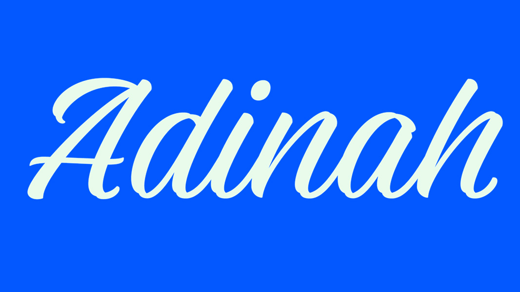
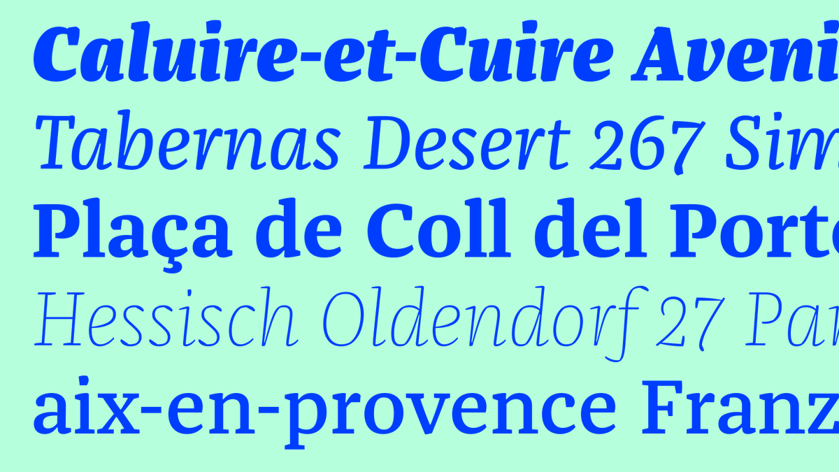
NEW on Fontstand is Franziska by TypeMates, a strong and robust text typeface with plenty of character in headline sizes thanks to mixing elements of Renaissance serifs and classical slabs with delicately balanced details, in 10 weights plus Italics.
fontstand.com/fonts/franziska

NEW on Fontstand is Franziska by @TypeMatesFonts, a strong and robust text typeface with plenty of character in headline sizes thanks to mixing elements of Renaissance serifs and classical slabs with delicately balanced details, in 10 weights plus Italics. fontstand.com/fonts/franziska
account_circle
Fontstand(@Fontstand) 's Twitter Profile Photo

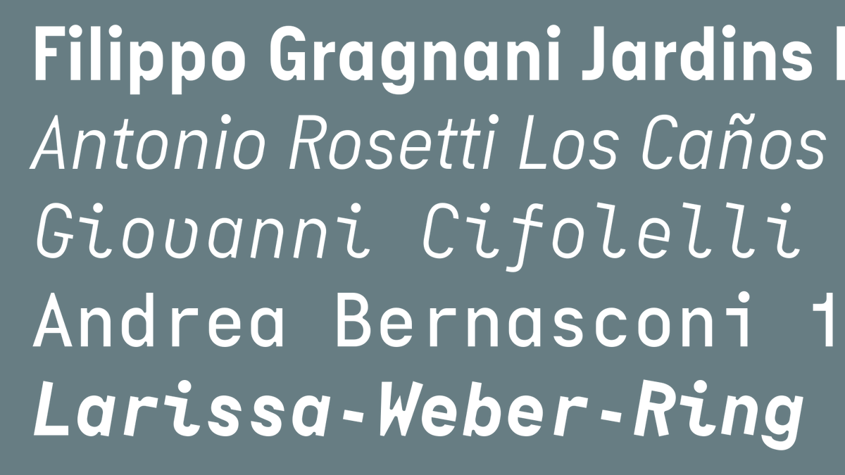
NEW: Piet Sans and Piet Mono from TypeMates are a playful pair of constructed typefaces with strange numbers, prominent ink traps, chunky forms, stylistic sets and a vibrant Mono Italic with shapes not simply slanted, but rotated on the baseline!

fontstand.com/fonts/piet-mono

NEW: Piet Sans and Piet Mono from @TypeMatesFonts are a playful pair of constructed typefaces with strange numbers, prominent ink traps, chunky forms, stylistic sets and a vibrant Mono Italic with shapes not simply slanted, but rotated on the baseline! fontstand.com/fonts/piet-mono
account_circle
Fontstand(@Fontstand) 's Twitter Profile Photo

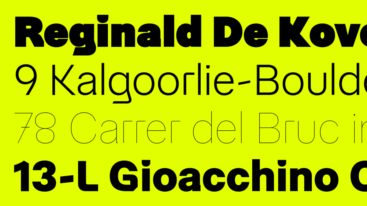
NEW: Restart Ginger by Superior Type is a daring reinterpretation of Restart Hard, with some characters dramatically redesigned to push the boundaries of legibility and add contemporary flair into visual identities, in 9 weights and a number of alternates.
fontstand.com/fonts/restart-…

NEW: Restart Ginger by Superior Type is a daring reinterpretation of Restart Hard, with some characters dramatically redesigned to push the boundaries of legibility and add contemporary flair into visual identities, in 9 weights and a number of alternates. fontstand.com/fonts/restart-…
account_circle
Fontstand(@Fontstand) 's Twitter Profile Photo

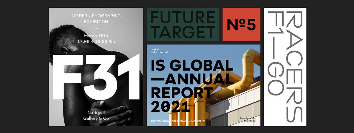
👋 Welcome Brink foundry to Fontstand, established by Andy Lethbridge and Christoph York in 2018, and based in Berlin and London. Brink creates type for branding, with modern aesthetics and frequently used by leading brands in identity design.

fontstand.com/foundries/brink

👋 Welcome Brink foundry to Fontstand, established by Andy Lethbridge and Christoph York in 2018, and based in Berlin and London. Brink creates type for branding, with modern aesthetics and frequently used by leading brands in identity design. fontstand.com/foundries/brink
account_circle
Fontstand(@Fontstand) 's Twitter Profile Photo

🚀 Fontstand is pleased to introduce a new foundry Halbfett, formerly known as Letter Omega, founded in Jakarta, Indonesia in 2016 by Deni Anggara. Halbfett collection is focused on versatility and utility and currently offers 12 modern sans families.

fontstand.com/foundries/halb…

🚀 Fontstand is pleased to introduce a new foundry Halbfett, formerly known as Letter Omega, founded in Jakarta, Indonesia in 2016 by Deni Anggara. Halbfett collection is focused on versatility and utility and currently offers 12 modern sans families. fontstand.com/foundries/halb…
account_circle
Fontstand(@Fontstand) 's Twitter Profile Photo

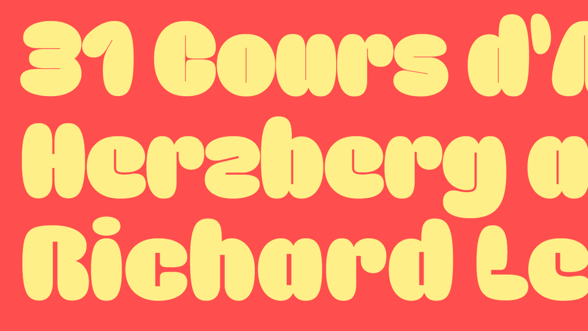
NEW: Irregardless by OH no Type Co is a casual display typeface for large, bold usage, with refined details and typographic extras, options and alternates, including wide round characters to spice up the rhythm and lovely heart dots ❣️
fontstand.com/fonts/irregard…
NEW: Irregardless by @OHnoTypeCo is a casual display typeface for large, bold usage, with refined details and typographic extras, options and alternates, including wide round characters to spice up the rhythm and lovely heart dots ❣️ fontstand.com/fonts/irregard…
account_circle
Fontstand(@Fontstand) 's Twitter Profile Photo

NEW: Degular Mono by OH no Type Co is the mono counterpart to the multipurpose sans family of the same name. Coming from the Text style, it retains its usefulness, but brings some fresh and surprising forms that allow the design to fit the monospaced grid.

fontstand.com/fonts/degular-…
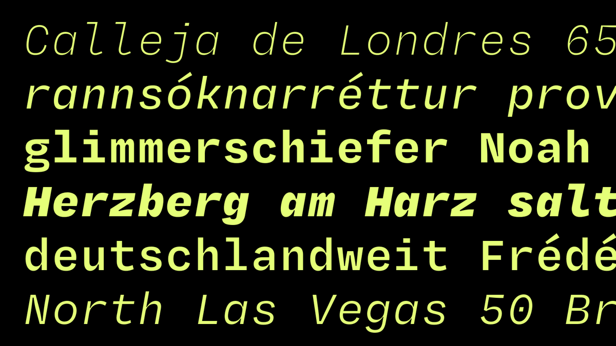
NEW: Degular Mono by @OHnoTypeCo is the mono counterpart to the multipurpose sans family of the same name. Coming from the Text style, it retains its usefulness, but brings some fresh and surprising forms that allow the design to fit the monospaced grid. fontstand.com/fonts/degular-…
account_circle
Fontstand(@Fontstand) 's Twitter Profile Photo

There’s a new foundry profile up on Fontstand News: OH no Type Co! Dan Reynolds interviewed James Edmondson for it, and you can read some of James’s thoughts on drawing, foundry-running, and art-nouveau ornaments over at fontstand.com/news/foundry-p…
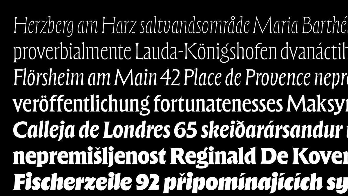
There’s a new foundry profile up on Fontstand News: @OHnoTypeCo! @typeoff interviewed @jamestedmondson for it, and you can read some of James’s thoughts on drawing, foundry-running, and art-nouveau ornaments over at fontstand.com/news/foundry-p…
account_circle
Fontstand(@Fontstand) 's Twitter Profile Photo

NEW: Retail by OH no Type Co in three optical sizes and 48 styles is a humanist sans with a broad spectrum of expression. The Display has a noticeable amount of horizontal stress and a vibrant feel, while the Text styles are toned down to a simplified form.

fontstand.com/fonts/retail-d…
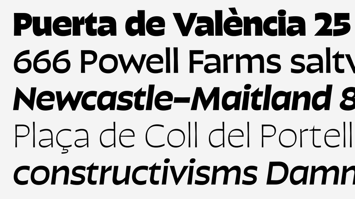
NEW: Retail by @OHnoTypeCo in three optical sizes and 48 styles is a humanist sans with a broad spectrum of expression. The Display has a noticeable amount of horizontal stress and a vibrant feel, while the Text styles are toned down to a simplified form. fontstand.com/fonts/retail-d…
account_circle
Fontstand(@Fontstand) 's Twitter Profile Photo

NEW: Forevs by OH no Type Co with classical width proportions in the capitals, and a lowercase that goes from narrow in the lighter weights, to normal in the heaviest. In seven weights, with italics, small caps, and lots of weird alternates. Great for logos!
fontstand.com/fonts/forevs
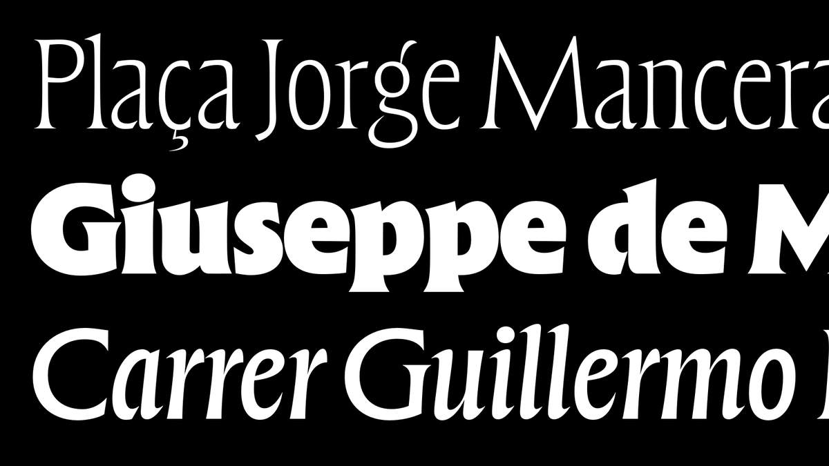
NEW: Forevs by @OHnoTypeCo with classical width proportions in the capitals, and a lowercase that goes from narrow in the lighter weights, to normal in the heaviest. In seven weights, with italics, small caps, and lots of weird alternates. Great for logos! fontstand.com/fonts/forevs
account_circle
Fontstand(@Fontstand) 's Twitter Profile Photo

NEW: Ohno Softie by OH no Type Co is a sweet, syrupy typeface in which not only every stroke and every terminal, but also every negative form is round and soft – in all five weights, from the elegant Light to the full-blown Black!
fontstand.com/fonts/ohno-sof…
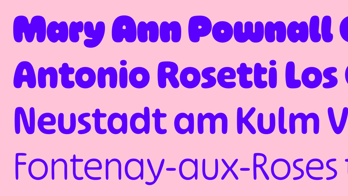
NEW: Ohno Softie by @OHnoTypeCo is a sweet, syrupy typeface in which not only every stroke and every terminal, but also every negative form is round and soft – in all five weights, from the elegant Light to the full-blown Black! fontstand.com/fonts/ohno-sof…
account_circle
Fontstand(@Fontstand) 's Twitter Profile Photo

Michela Zoppi interviewed Haakon Spencer & Matthew Fenton, two ECAL grads working in London. For a while, they’ve been producing meaningful work. Now, they’re also showing their type design. You can read what they have to say to each other in her Essay at fontstand.com/news/essays/tr…

Michela Zoppi interviewed Haakon Spencer & Matthew Fenton, two ECAL grads working in London. For a while, they’ve been producing meaningful work. Now, they’re also showing their type design. You can read what they have to say to each other in her Essay at fontstand.com/news/essays/tr…
account_circle
Fontstand(@Fontstand) 's Twitter Profile Photo

NEW: from David Jonathan Ross is Nickel Gothic, a stocky grotesque based on a lettering found on a 1918 Chinese banknote, with overtones of later midcentury sans serifs or ’70s squared gothics. Available in only one weight, but in 7 widths, all with an oblique style.

fontstand.com/fonts/nickel-g…
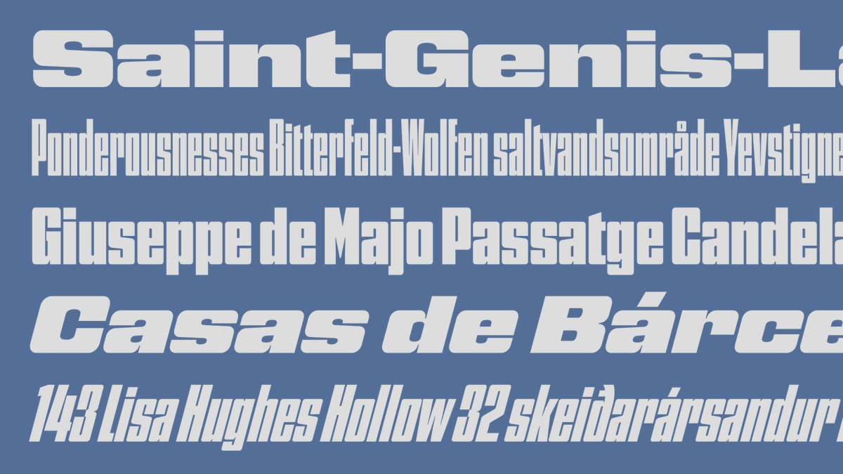
NEW: from @djrrb is Nickel Gothic, a stocky grotesque based on a lettering found on a 1918 Chinese banknote, with overtones of later midcentury sans serifs or ’70s squared gothics. Available in only one weight, but in 7 widths, all with an oblique style. fontstand.com/fonts/nickel-g…
account_circle
Fontstand(@Fontstand) 's Twitter Profile Photo

NEW: Geogrotesque Mono by Emtype Foundry is the monospaced counterpart to the popular Geogrotesque family, with rounded finish and a warm appearance, in seven weights and seven underlined styles, plus variable fonts. Rent by the month or subscribe to the foundry.
fontstand.com/fonts/geogrote…
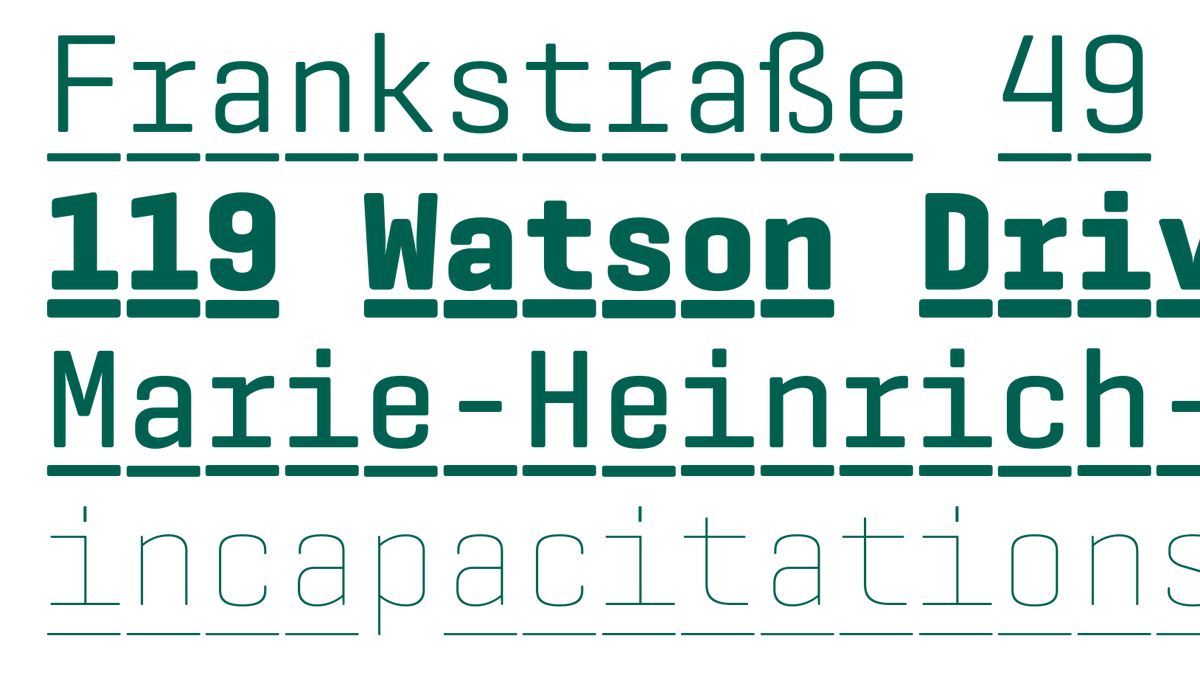
NEW: Geogrotesque Mono by @emtype is the monospaced counterpart to the popular Geogrotesque family, with rounded finish and a warm appearance, in seven weights and seven underlined styles, plus variable fonts. Rent by the month or subscribe to the foundry. fontstand.com/fonts/geogrote…
account_circle
Fontstand(@Fontstand) 's Twitter Profile Photo

On Fontstand News, Dan Reynolds reviews “Adventures in Type and Space” from Ten Acre Films on the graphic design for Doctor Who’s opening titles & post-credit sequences from 1963 to 1989. A must-read for anyone interested in TV productions at that time.
fontstand.com/news/book-revi…

On Fontstand News, @typeoff reviews “Adventures in Type and Space” from @tenacrefilms on the graphic design for Doctor Who’s opening titles & post-credit sequences from 1963 to 1989. A must-read for anyone interested in TV productions at that time. fontstand.com/news/book-revi…
account_circle
Fontstand(@Fontstand) 's Twitter Profile Photo

NEW: Neon Nbl from CAST is a faithful digital redesign of the original geometric monocase sans typeface released by Nebiolo in 1933, now produced in a coordinated range of 5 weights and 4 widths, plus the decorative shaded titling version (Ombra).
fontstand.com/fonts/neon

NEW: Neon Nbl from @castfoundry is a faithful digital redesign of the original geometric monocase sans typeface released by Nebiolo in 1933, now produced in a coordinated range of 5 weights and 4 widths, plus the decorative shaded titling version (Ombra). fontstand.com/fonts/neon
account_circle
Fontstand(@Fontstand) 's Twitter Profile Photo

NEW: Fabbrica by CAST, is an industrial sans serif with squared curves and technical-geometric letterforms in 8 weights (plus italics) and 2 variants: Fabbrica and Fabbrica Sharp. Functional and readable at smaller sizes, distinct in big headlines.
fontstand.com/fonts?search=f…

NEW: Fabbrica by @castfoundry, is an industrial sans serif with squared curves and technical-geometric letterforms in 8 weights (plus italics) and 2 variants: Fabbrica and Fabbrica Sharp. Functional and readable at smaller sizes, distinct in big headlines. fontstand.com/fonts?search=f…
account_circle
Fontstand(@Fontstand) 's Twitter Profile Photo

If you want to know more about our strategic thinking on font distribution, you might want to read the short article about Fontstand’s new Foundry Subscription model and why we think it can mean more freedom and convenience for both type users and creators fontstand.com/news/essays/fo…

If you want to know more about our strategic thinking on font distribution, you might want to read the short article about Fontstand’s new Foundry Subscription model and why we think it can mean more freedom and convenience for both type users and creators fontstand.com/news/essays/fo…
account_circle
Fontstand(@Fontstand) 's Twitter Profile Photo

NEW: Perec Scripte by PampaType foundry, a unique vertical script with a delicate tone in two complementary styles: Unlinked and Linked, each with 6 weights, plus a Deco style for added impact. Part of the Perec superfamily, a tribute to the writer Georges Perec.
fontstand.com/fonts/perec-sc…
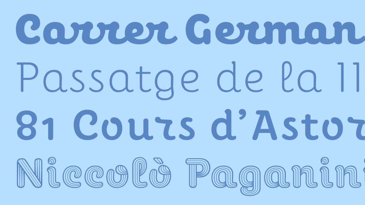
NEW: Perec Scripte by @pampatype, a unique vertical script with a delicate tone in two complementary styles: Unlinked and Linked, each with 6 weights, plus a Deco style for added impact. Part of the Perec superfamily, a tribute to the writer Georges Perec. fontstand.com/fonts/perec-sc…
account_circle
Fontstand(@Fontstand) 's Twitter Profile Photo

NEW: Burghi by CAST, inspired by the graphic styles of early fast-food joints with their fat and rounded letterforms, is a variable display font with an optical size axis allowing you to set the width of inner counters from tiny to slightly wider.

fontstand.com/fonts/burghi

NEW: Burghi by @castfoundry, inspired by the graphic styles of early fast-food joints with their fat and rounded letterforms, is a variable display font with an optical size axis allowing you to set the width of inner counters from tiny to slightly wider. fontstand.com/fonts/burghi
account_circle